How to Design a Modern Kitchen Without a Full Remodel
The smartest kitchen upgrades aren’t always the biggest ones. In many homes, the most effective changes come from improving how the space feels and...
2 min read

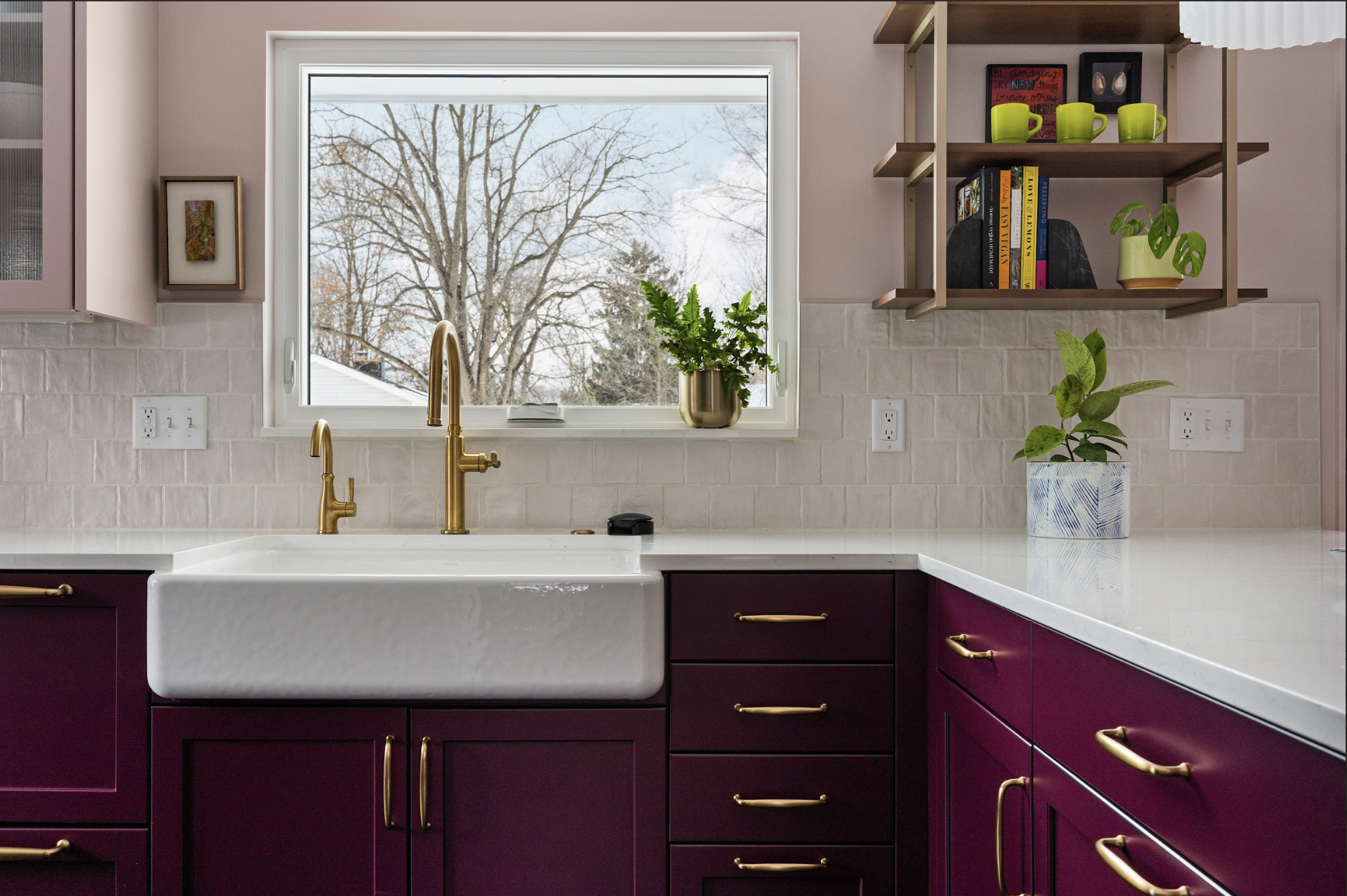
The smartest kitchen upgrades aren’t always the biggest ones. In many homes, the most effective changes come from improving how the space feels and...
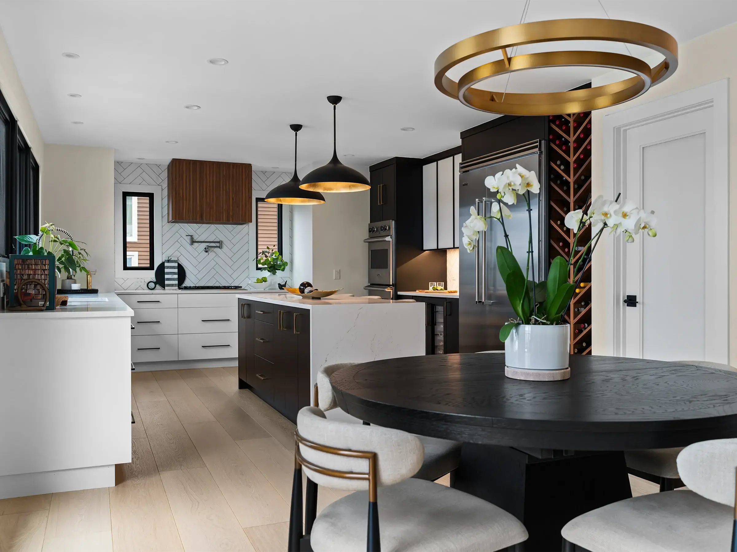
When the outside world feels stressful, there is nothing better than coming home to a space that feels welcoming, calm, and restorative. With a few...

1 min read
Every home remodeling journey comes with its own set of emotions, and no project is without its ups and downs. After remodeling homes in the greater...